View Agent Overview and Implementation
1. Overview
View Agent is a lightweight web application designed to support user decision-making by visualizing both structured and unstructured data from various analytical perspectives. As a “View Agent,” this system interacts with external analytical AIs to deliver an interactive user experience that presents analysis results in the most appropriate format.
2. Features
2.1. Overview
View Agent is a platform with the following key characteristics:
- It functions as a microservice using a lightweight web framework based on Flask, enabling data input and output via HTTP.
- Its internal structure allows easy addition of features and switching of display templates through routing.
- Analytical AIs can simply specify metadata when passing information to View Agent, enabling seamless switching of visualization styles—almost like switching between different analytical applications.
Available visualization formats include network diagrams, bar charts, word clouds, and Sankey diagrams. These diverse analytical formats, each with varying computational complexity, allow users to interpret data from multiple perspectives.
As an advanced feature, View Agent can be combined with HTML templates and LLMs (Large Language Models) to allow interactive display customization. Furthermore, View Agent can dynamically cooperate with both analytical AIs and LLMs to automatically explore the most suitable visualization style.
2.2. Architecture
View Agent is a simple yet extensible web application composed of the following components:
2.2.1. Core Application (app.py)
- A Python-based web server built with Flask
- Handles routing to each HTML template (visualization view)
- Supports data exchange; future versions may support CSV input and API integration
2.2.2. Front-End Template Files (within the static/ directory)
- Multiple visualization views provided in HTML format
- Each file represents an independent visualization (e.g., index-network.html, index-bar.html)
- Primarily uses JavaScript libraries such as D3.js or Chart.js for rendering
2.2.3. Integration with Agent
- Visualization modes can be switched by sending display data and metadata specifying the type of visualization via HTTP
- Future plans include automatic view recommendations powered by LLMs and display modifications through chat interactions
2.3. Display Modes
Currently, the system includes nine default visualization modes. These modes can be dynamically switched using metadata defined within the dataset passed from the AI analysis agent. They also support processing as part of a pipeline.
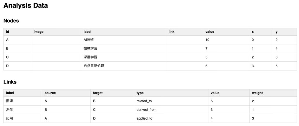
2.3.1. Table


Tabular visualization is highly effective for analyses where accurate inspection and comparison of detailed data is essential. It is particularly useful in scenarios where users want to:
- View the exact values
- Compare values side-by-side
- Apply filters or sorting
Examples of effective use cases include:
- Purchase history per customer (name, product, price, date)
- Product lists (model number, inventory, unit price, etc.)
- Monthly sales trends (numerical comparison)
- Survey responses or proportions (precise percentage comparison)
Tables are excellent for identifying fine differences or verifying specific details that are difficult to spot in charts. When combined with tools like Excel, tables also enable aggregation, sorting, filtering, checking which variables exist, inspecting missing values, data types, and identifying outliers or anomalies through visual inspection.
Scenarios suited for tables:
- When precise value confirmation is required
- When the dataset includes many columns or rows
- When users want to perform their own analysis
- When data input/editing by users is necessary
Sample input data for table display:
analysis_data = {
  "nodes": [
    { "id": "A", "label": "AI Technology", "value": 10 },
    { "id": "B", "label": "Machine Learning", "value": 7 },
    { "id": "C", "label": "Deep Learning", "value": 5 }
  ],
  "links": [
    { "source": "A", "target": "B", "weight": 2, "type": "related_to" },
    { "source": "B", "target": "C", "weight": 1, "type": "derived_from" }
  ],
  "metadata": {
    "output_type": "table"
  }
}
2.3.2. Bar Chart


Bar charts are a suitable visualization method for comparing quantities across categories. They are especially effective when the goal is to clearly show “Which items are the most or least?”
Use cases where bar charts are effective:
- Sales by product category
- Population by prefecture or region
- Purchase counts by age group
- Monthly sales, weekly website visits, annual number of incidents
- Comparison across multiple dimensions, such as gender × product category or region × store type using stacked or grouped bar charts
- Visualizing rankings, comparisons between goals and results
Typical characteristics of data suited for bar charts:
- Numerical values for each category
- Each item is independent (e.g., Company A, B, C)
- Purpose is to compare, rank, or identify gaps
Sample input data for bar chart:
analysis_data = {
  "nodes": [
    { "label": "AI Technology", "value": 10 },
    { "label": "Machine Learning", "value": 7 },
    { "label": "Deep Learning", "value": 5 },
    { "label": "Natural Language Processing", "value": 6 }
  ],
  "metadata": {
    "output_type": "bar"
  }
}
2.3.3. Scatter Plot


Scatter plots are well-suited for visually analyzing the relationships (correlations) between two variables. They are particularly useful when trying to explore patterns such as “What happens to Y when X increases?”
Use cases where scatter plots are effective:
- Relationship between advertising expenses and sales
- Temperature vs. ice cream sales
- Study time vs. test scores
Scatter plots can help identify positive, negative, or no correlation at a glance. When combined with a correlation coefficient (r), they also support quantitative analysis.
Other applications include:
- Customer segmentation: age vs. spending
- Product positioning: price vs. performance
- Detecting outliers (anomalies)
- Pre-modeling visualization for regression or PCA
- Clustering (e.g., k-means) for finding grouped data points
Data characteristics suitable for scatter plots:
- Both axes represent continuous numerical data
- X and Y have meaningful interpretations
- The goal is to understand trends, correlations, or distributions
Sample input data for scatter plot:
analysis_data = {
  "nodes": [
    { "id": "A", "label": "AI Technology", "x": 1, "y": 10, "value": 10 },
    { "id": "B", "label": "Machine Learning", "x": 3, "y": 7, "value": 7 },
    { "id": "C", "label": "Deep Learning", "x": 5, "y": 5, "value": 5 },
    { "id": "D", "label": "Natural Language Processing", "x": 7, "y": 8, "value": 6 }
  ],
  "metadata": {
    "output_type": "scatter"
  }
}
2.3.4. Line Chart


Line charts are ideal for analyzing changes and trends over time. They are especially useful when you want to visualize how things have changed and when.
Use cases where line charts are effective:
- Time series analysis to observe trends
- Comparing rates of change or fluctuations
- Comparing multiple data series
- Detecting anomalies or outliers
- Visualizing experimental or simulation results
Data characteristics suitable for line charts:
- The horizontal axis represents time or a continuous scale (e.g., date, time, distance, temperature)
- The vertical axis represents quantity (e.g., sales, website visits, scores)
- The goal is to understand trends or directional changes over time
Sample input data for a line chart:
analysis_data = {
  "nodes": [
    { "id": "A", "label": "AI Technology", "x": 0, "y": 2 },
    { "id": "B", "label": "Machine Learning", "x": 1, "y": 4 },
    { "id": "C", "label": "Deep Learning", "x": 2, "y": 6 },
    { "id": "D", "label": "Natural Language Processing", "x": 3, "y": 5 },
    { "id": "E", "label": "Generative AI", "x": 4, "y": 8 }
  ],
  "metadata": {
    "output_type": "line"
  }
}
2.3.5. Bubble Chart


Bubble charts allow you to visualize relationships among three or more numerical variables at once. They are especially effective when you want to analyze two variables while simultaneously representing a third quantitative variable (e.g., with bubble size).
Use cases where bubble charts are effective:
- Comparing multiple metrics such as:
- Sales (x-axis) × Profit Margin (y-axis) × Number of Units Sold (bubble size)
- GDP × Life Expectancy × Population (Gapminder-style)
- Multivariate analysis with additional visual encoding (e.g., color as a fourth dimension)
- Business portfolio analysis, such as Growth Rate × Market Share × Revenue (BCG Matrix + Bubble)
- Marketing or customer segmentation analysis (e.g., Age × Spending × Number of Customers)
- Product or brand comparison (Price × Performance × Awareness)
- Scientific data: Temperature × Pressure × Reaction Rate
Data characteristics suited for bubble charts:
- Both axes represent numerical data
- Each point has an associated third variable (bubble size)
- Useful when comparing multiple entities (around 10–50 items for readability)
Sample input data for a bubble chart:
analysis_data = {
  "nodes": [
    { "id": "A", "label": "AI Technology", "value": 10 },
    { "id": "B", "label": "Machine Learning", "value": 7 },
    { "id": "C", "label": "Deep Learning", "value": 5 }
  ],
  "metadata": {
    "output_type": "bubble"
  }
}
2.3.6. Tree Diagram


Tree diagrams are used to clearly visualize hierarchical relationships and classification structures. They are especially useful when analyzing or explaining how an entire structure branches or how higher-level categories break down into subcategories.
Use cases where tree diagrams are effective:
- Product categories (e.g., Electronics → AV Equipment → Televisions)
- Organizational charts (Company → Department → Team → Members)
- Folder or file structure visualization
- Decision tree models for classification and prediction
- Root cause analysis (e.g., 5 Whys method)
- MECE-based breakdown trees for logical thinking
- Sales or cost breakdown by hierarchy (e.g., Country → Region → Store)
- KPI decomposition trees (e.g., Sales = Unit Price × Quantity)
- Visualization of phylogenetic trees, algorithm structures, or program logic
Data characteristics suited for tree diagrams:
- Clear parent-child or top-down relationships
- Branching structure with drill-down capabilities
- Meaningful analysis through tracing paths or decision routes
Sample input data for a tree diagram:
analysis_data = {
  "treeData": {
    "name": "AI Technology",
    "children": [
      {
        "name": "Machine Learning",
        "children": [
          { "name": "Supervised Learning" },
          { "name": "Unsupervised Learning" }
        ]
      },
      {
        "name": "Deep Learning",
        "children": [
          { "name": "CNN" },
          { "name": "RNN" }
        ]
      },
      {
        "name": "Natural Language Processing"
      }
    ]
  },

  "metadata": {
    "output_type": "tree"
  }
}
2.3.7. Heatmap


Heatmaps are powerful visualizations that use color to intuitively represent the distribution, strength, and patterns of numerical data. They are especially useful when you want to quickly grasp “Where is it high? Where is it low?”
Use cases where heatmaps are effective:
- Pattern recognition in matrix data (e.g., cross-tabulations or correlation matrices)
- Visualizing density or distribution in geographic data (geo heatmaps)
- Analyzing user behavior on web pages or apps (e.g., click heatmaps)
- Mapping activity over time (e.g., calendars or time-series grids)
- Scientific applications, such as in biology or genetic data analysis
Data characteristics suited for heatmaps:
- Data is structured in a matrix format (rows × columns of numerical values)
- Color gradients represent meaningful variations in intensity
- Combining with time or spatial axes can enhance interpretability
Sample input data for a heatmap:
analysis_data = {
  "matrix": [
    { "row": "AI Technology", "col": "2020", "value": 3 },
    { "row": "AI Technology", "col": "2021", "value": 7 },
    { "row": "AI Technology", "col": "2022", "value": 9 },
    { "row": "Machine Learning", "col": "2020", "value": 2 },
    { "row": "Machine Learning", "col": "2021", "value": 5 },
    { "row": "Machine Learning", "col": "2022", "value": 8 },
    { "row": "Deep Learning", "col": "2020", "value": 4 },
    { "row": "Deep Learning", "col": "2021", "value": 6 },
    { "row": "Deep Learning", "col": "2022", "value": 7 }
  ],
  "metadata": {
    "output_type": "heatmap"
  }
}
2.3.8. Network Diagram


Network diagrams are effective for visualizing relationships (links) between entities. They are especially powerful when analyzing structures such as “Who is connected to whom?” or “Which entities influence each other?”
Use cases where network diagrams are effective:
- Social network analysis: identify central figures, intermediaries, or isolated nodes
- Knowledge graphs or concept maps: visualize clusters of related concepts for exploration or organization
- Web or hyperlink structure analysis
- Biological, chemical, or physical structure modeling
- Supply chain or transaction networks
- Causal relationships, algorithm flows, or information transfer diagrams
Data characteristics suited for network diagrams:
- The data includes links or relationships (e.g., A → B)
- Complex connections that can’t be represented by simple hierarchies or trees
- Nodes have attributes such as labels, weights, or categories, which enhance analysis
Sample input data for a network diagram:
analysis_data = {
  "nodes": [
    { "id": "A", "label": "AI Technology", "value": 10 },
    { "id": "B", "label": "Machine Learning", "value": 7 },
    { "id": "C", "label": "Deep Learning", "value": 5 },
    { "id": "D", "label": "Natural Language Processing", "value": 6 }
  ],
  "links": [
    { "source": "A", "target": "B", "weight": 2 },
    { "source": "B", "target": "C", "weight": 1 },
    { "source": "A", "target": "D", "weight": 3 }
  ],
  "metadata": {
    "output_type": "network"
  }
}
2.3.9. Sankey Diagram


Sankey diagrams are used to visualize flows and the magnitude of movement between entities. They are especially effective when analyzing “How much flows from where to where?”
Use cases where Sankey diagrams are effective:
- Analyzing the flow of energy or resources
- Budget, cost, or financial flow breakdowns
- Process or workflow branching analysis
- User behavior transition analysis (e.g., how users move through a website or app)
Data characteristics suited for Sankey diagrams:
- There are quantitative flows between nodes
- Branching and merging flows exist
- Source and destination nodes differ
Sample input data for a Sankey diagram:
analysis_data = {
  "nodes": [
    { "id": "A", "label": "AI Technology", "name": "AI Technology" },
    { "id": "B", "label": "Machine Learning", "name": "Machine Learning" },
    { "id": "C", "label": "Deep Learning", "name": "Deep Learning" },
    { "id": "D", "label": "Applied Fields", "name": "Applied Fields" }
  ],
  "links": [
    { "source": "A", "target": "B", "value": 5 },
    { "source": "B", "target": "C", "value": 3 },
    { "source": "C", "target": "D", "value": 4 }
  ],
  "metadata": {
    "output_type": "sankey"
  }
2.3.10. Sunburst Chart


Sunburst charts are effective for visualizing hierarchical data structures. They are particularly useful when analyzing step-by-step flows, navigation paths, or multi-level breakdowns of categories.
Use cases where sunburst charts are effective:
- Visualizing folder structures, classification hierarchies, or website information architecture
- Comparing numerical values at each level of a hierarchy (e.g., revenue per product category)
- Visualizing page transition paths in web user behavior
- Process flows or user journeys with branching and depth
- Organizing knowledge into Topic → Subtopic → Concept formats
Data characteristics suited for sunburst charts:
- Tree-structured or nested JSON data
- Nodes associated with quantitative values (e.g., sales, counts, costs) enhance visualization
- Ideal for showing proportion and depth simultaneously
Sample input data for a sunburst chart:
analysis_data = {
  "treeData": {
    "name": "AI Technology",
    "children": [
      {
        "name": "Machine Learning",
        "children": [
          { "name": "Supervised Learning", "value": 5 },
          { "name": "Unsupervised Learning", "value": 3 }
        ]
      },
      {
        "name": "Deep Learning",
        "children": [
          { "name": "CNN", "value": 4 },
          { "name": "RNN", "value": 2 }
        ]
      },
      {
        "name": "Natural Language Processing",
        "value": 6
      }
    ]
  },
  "metadata": {
    "output_type": "sunburst"
  }
}
2.3.11. Word Cloud


Word clouds are a visual method for summarizing and analyzing text data. They are particularly effective for quickly identifying frequent or important terms within large volumes of text.
Use cases where word clouds are effective:
- Extracting frequent or characteristic words from large text sources such as social media posts, survey responses, reviews, and articles
- Highlighting important keywords visually—frequent terms appear larger
- Comparing trends across different time periods or user segments by aligning multiple word clouds
- Combining with categories to create emotion- or topic-specific word clouds
Data characteristics suited for word clouds:
- The goal is to extract keywords or topics
- The input consists of natural language text
- The data is unstructured but abundant
- Visualization based on word frequency carries meaningful insight
Sample input data for a word cloud:
analysis_data = {
  "nodes": [
    { "id": "A", "label": "AI Technology", "value": 10 },
    { "id": "B", "label": "Machine Learning", "value": 7 },
    { "id": "C", "label": "Deep Learning", "value": 5 },
    { "id": "D", "label": "Natural Language Processing", "value": 6 }
  ],

  "metadata": {
  "output_type": "wordcloud"
  }
}
3. Implementation
Below is an example implementation of the View Agent. In this example, data input and output are structured for integration with XTDB or similar databases, but here, we demonstrate a mock implementation using hardcoded input.
Folder Structure:
├── app.py
└── static
    ├── images
    │   ├── ai.png
    │   ├── dl.png
    │   ├── ml.png
    │   └── nlp.png
    ├── index-bar.html
    ├── index-bubble.html
    ├── index-heatmap.html
    ├── index-line.html
    ├── index-network.html
    ├── index-sankey.html
    ├── index-scatter.html
    ├── index-sunburst.html
    ├── index-table.html
    ├── index-tree.html
    ├── index-wordcloud.html
    └── index2.html
Example Code: app.py
from flask import Flask, send_from_directory, jsonify
app = Flask(__name__, static_folder='static')

# Hardcoded analysis data with metadata

analysis_data = {
    "nodes": [
        { "id": "A", "label": "AI Technology", "value": 10, "x": 0, "y": 2, "image": "/images/ai.png", "link": "" },
        { "id": "B", "label": "Machine Learning", "value": 7, "x": 1, "y": 4, "image": "/images/ml.png", "link": "" },
        { "id": "C", "label": "Deep Learning", "value": 5, "x": 2, "y": 6, "image": "/images/dl.png", "link": "" },
        { "id": "D", "label": "Natural Language Processing", "value": 6, "x": 3, "y": 5, "image": "/images/nlp.png", "link": "" }
    ],
    "links": [
        { "source": "A", "target": "B", "weight": 2, "label": "Related", "type": "related_to", "value": 5 },
        { "source": "B", "target": "C", "weight": 1, "label": "Derived", "type": "derived_from", "value": 3 },
        { "source": "A", "target": "D", "weight": 3, "label": "Applied", "type": "applied_to", "value": 4 }
    ],
    "heatmap": [
        [1, 2, 3, 4],
        [2, 4, 6, 8],
        [3, 6, 9, 12],
        [4, 8, 12, 16]
    ],
    "treeData": {
        "name": "AI Technology",
        "children": [
            {
                "name": "Machine Learning",
                "children": [
                    { "name": "Supervised Learning", "value": 5 },
                    { "name": "Unsupervised Learning", "value": 3 }
                ]
            },
            {
                "name": "Deep Learning",
                "children": [
                    { "name": "CNN", "value": 4 },
                    { "name": "RNN", "value": 2 }
                ]
            },
            {
                "name": "Natural Language Processing",
                "value": 6
            }
        ]
    },
    "metadata": {
        "output_type": "wordcloud"  # Change to 'bar', 'bubble', 'network', etc. to test different views
    }
}

@app.route('/')
def index():
    output_type = analysis_data.get("metadata", {}).get("output_type", "default")
    filename = f'index-{output_type}.html'
    try:
        return send_from_directory(app.static_folder, filename)
    except:
        return send_from_directory(app.static_folder, 'index2.html')  # Fallback

@app.route('/api/analysis')
def get_analysis():
    return jsonify(analysis_data)

if __name__ == '__main__':
    app.debug = True
    app.run(host='0.0.0.0', port=8000)
Sample HTML: Scatter Plot View
<!DOCTYPE html>
<html>
<head>
  <meta charset="utf-8">
  <title>Scatter Plot</title>
  <script src="https://d3js.org/d3.v7.min.js"></script>
  <style>
    svg { border: 1px solid #ccc; }
  </style>
</head>

<body>
  <h2>Scatter Plot</h2>
  <svg width="800" height="600"></svg>
  <script>
    fetch('/api/analysis')
      .then(res => res.json())
      .then(data => {
        const nodes = data.nodes;
        const svg = d3.select("svg");
        const width = +svg.attr("width");
        const height = +svg.attr("height");
        const margin = { top: 40, right: 40, bottom: 50, left: 50 };
        const plotWidth = width - margin.left - margin.right;
        const plotHeight = height - margin.top - margin.bottom;
        const xScale = d3.scaleLinear()
          .domain([0, d3.max(nodes, d => d.x) || 10])
          .range([0, plotWidth]);
        const yScale = d3.scaleLinear()
          .domain([0, d3.max(nodes, d => d.y) || 10])
          .range([plotHeight, 0]);
        const g = svg.append("g")
          .attr("transform", `translate(${margin.left},${margin.top})`);

        // X-axis

        g.append("g")
          .attr("transform", `translate(0, ${plotHeight})`)
          .call(d3.axisBottom(xScale));

        // Y-axis

        g.append("g")
          .call(d3.axisLeft(yScale));

        // Points

        g.selectAll("circle")
          .data(nodes)
          .enter()
          .append("circle")
          .attr("cx", d => xScale(d.x))
          .attr("cy", d => yScale(d.y))
          .attr("r", d => d.value || 5)
          .attr("fill", "steelblue");

        // Labels

        g.selectAll("text.label")
          .data(nodes)
          .enter()
          .append("text")
          .attr("class", "label")
          .attr("x", d => xScale(d.x))
          .attr("y", d => yScale(d.y) - 10)
          .attr("text-anchor", "middle")
          .text(d => d.label);
      });
  </script>
</body>
</html>
4. Advanced Features
View Agent can be flexibly extended by adding visualization code templates as needed. In addition, minor modifications to each template can be made by forming a HITL (Human In The Loop) structure: <display once in the template>→<modification desired>→<indicate template used and direction of modification, and prompt for creation of new template>→<display in new template>. A loop can be formed and modifications made in the following manner.
This can be done, for example, in a bar chart like the following


If you want to make the color of the bars red and reduce their width, you can use the prompt “Make the color of the bars red and the width of the bars half,” which will display something like the following.

Other possible developments include the following.
4.1. Integration with LLM Agents
- Automatically visualize responses from ChatGPT or local analytical AIs in the most appropriate format.
4.2. Dynamic Data Binding
- Enable data integration through CSV, graphs, or file uploads for flexible and dynamic input sources.
4.3. Real-Time Collaborative Editing
- Support simultaneous viewing and layout-based collaborative analysis by multiple users in real time.
5. Conclusion
View Agent positions itself as a platform that emphasizes the often-overlooked final stage of the analytical process—visualization. It enables users to not only “see” the data, but also understand “why it appears that way,” delivering a more insightful and human-oriented analysis experience.
By integrating with advanced AI analysis agents and tools, View Agent can provide a collaborative and intelligent visualization environment that enhances both clarity and decision-making power.
6. References
- The Visual Display of Quantitative Information
- Infographics
- Flask Web Development: Developing Web Applications with Python
- Learn D3.js: Create interactive data-driven visualizations for the web with the D3.js library
- An Introduction to Multi-Agent Systems
- Artificial Intelligence: Foundations of Computational Agents
- 100 Things Every Designer Needs to Know About People


AIシステム設計・意思決定構造の設計を専門としています。
Ontology・DSL・Behavior Treeによる判断の外部化、マルチエージェント構築に取り組んでいます。
Specialized in AI system design and decision-making architecture.
Focused on externalizing decision logic using Ontology, DSL, and Behavior Trees, and building multi-agent systems.