Machine Learning Artificial Intelligence Semantic Web Ontology Digital Transformation Web Technology Knowledge Information Processing Reasoning Technology DX Case Study Navigation of this blog
About User interface and data visualization Technologies
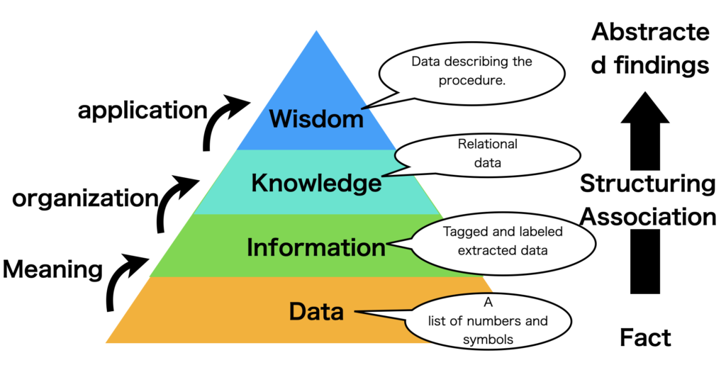
The DIKW pyramid is one of the most commonly used frameworks when data is being used. (Figure below)

Data (data) is a collection of observed facts that have not been processed in any way. The process of converting data into information involves structuring the data, and by further structuring the data, we can relate the data, organize the information, and utilize it as Knpwledge (knowledge) and Wisdom (wisdom).
Using computers to process data is equivalent to creating value by visualizing the structure of such data.
Furthermore, the data itself can be interpreted in multiple ways from multiple perspectives, and in order to visualize them, we need a well-designed user interface.
In this blog, we will discuss the user interface and data visualization.
Implementation
- Bokeh, Plotly, and Tableau, interactive data visualization tools
Bokeh, Plotly, and Tableau are a variety of tools and libraries used for data visualization and are used in a variety of applications as interactive data visualization tools.
- User-Customized Learning Assistance with Natural Language Processing
User-customized learning aids utilizing natural language processing (NLP) are being offered in a variety of areas, including the education field and online learning platforms. This section describes the various algorithms used and their specific implementations.
- About Monitoring and Supporting Online Discussions Using Natural Language Processing
Monitoring and supporting online discussions using Natural Language Processing (NLP) is used in online communities, forums, and social media platforms to improve the user experience, facilitate appropriate communication, and detect problems early. It is an approach that can be used to improve the user experience, facilitate appropriate communication, and detect problems early. This paper describes various algorithms and implementations of online discussion monitoring and support using natural language processing (NLP).
- About LLE (Locally Linear Embedding)
LLE (Locally Linear Embedding) is a nonlinear dimensionality reduction algorithm that embeds high-dimensional data into a lower dimension. It assumes that the data is locally linear and reduces the dimension while preserving the local structure of the data. It is primarily used for tasks such as clustering, data visualization, and feature extraction.
- About Multidimensional Scaling (MDS)
Multidimensional Scaling (MDS) is a statistical method for visualizing multivariate data that provides a way to place data points in a low-dimensional space (usually two or three dimensions) while preserving distances or similarities between the data. This technique is used to transform high-dimensional data into easily understandable low-dimensional plots that help visualize data features and clustering.
- About t-SNE (t-distributed Stochastic Neighbor Embedding)
t-SNE is a nonlinear dimensionality reduction algorithm that embeds high-dimensional data into lower dimensions. t-SNE is mainly used for tasks such as data visualization and clustering, where its particular strength is its ability to preserve the nonlinear structure of high-dimensional data. t-SNE’s main ideas are The main idea of t-SNE is to reflect the similarity of high-dimensional data in a low-dimensional space.
Access Control technology is a security technique for controlling access to information systems and physical locations so that only authorized users can access authorized resources, protecting the confidentiality, integrity, and availability of data, and enforcing security It is a widely used technology to protect the confidentiality, integrity, and availability of data and to enforce security policies. This section describes various algorithms and implementation examples for this access control technique.
D3.js and React, which are based on Javascript, can be used as tools for visualizing relational data such as graph data. In this article, we will discuss specific implementations using D3 and React for 2D and 3D graph displays, and heat maps as a form of displaying relational data.
Displaying and animating graph snapshots on a timeline is an important technique for analyzing graph data, as it helps visualize changes over time and understand the dynamic characteristics of graph data. This section describes libraries and implementation examples used for these purposes.
This paper describes the creation of animations of graphs by combining NetworkX and Matplotlib, a technique for visually representing dynamic changes in networks in Python.
Methods for plotting high-dimensional data in low dimensions using dimensionality reduction techniques to facilitate visualization are useful for many data analysis tasks, such as data understanding, clustering, anomaly detection, and feature selection. This section describes the major dimensionality reduction techniques and their methods.
Gephi is an open-source graph visualization software that is particularly suitable for network analysis and visualization of complex data sets. Here we describe the basic steps and functionality for visualizing data using Gephi.
Cytoscape.js is a graph theory library written in JavaScript that is widely used for visualizing network and graph data. Cytoscape.js makes it possible to add graph and network data visualization to web and desktop applications. Here are the basic steps and example code for data visualization using Cytoscape.js.
- Visualization of Graph Data Using Sigma.js
Sigma.js is a web-based graph visualization library that can be a useful tool for creating interactive network diagrams. Here we describe the basic steps and functions for visualizing graph data using Sigma.js.
PlantUML will be a tool that can automatically draw various open source data models and is based on graphviz, an open source drawing tool provided by AT&T Laboratories. It will be a component for quickly creating various diagrams such as those shown below.
There are various ways to use plantUML. (1) using Jar files, (2) using brew on Mac, (3) Web services, and (4) planting in applications.
seesaw is a Clojure library that can be used to easily create a UI as a desktop application. This is a version of Swing, a Java graphical library, that can be used with Clojure.
Clojure Quil is a library for creating 2D graphics and animation written in the Clojure programming language. Quil allows users to create 2D graphics and animations using programs written in Clojure.
Unity is an integrated development environment (IDE) for game and application development developed by Unity Technologies and widely used in various fields such as games, VR, AR, and simulations. This paper describes the integration of Unity with artificial intelligence systems such as CMS, chatbot, ES, machine learning, and natural language processing.
CSS (Cascading Style Sheets) is a style sheet language used to specify the style and layout of documents created in markup languages such as HTML and XML, Bootstrap is a framework for building responsive websites and web applications using HTML, CSS, and JavaScript.
This section mainly discusses the various implementations of bootstrap.
Application
This book is a translation of Search User Interfaces (Cambridge University Press, 2009), which systematically discusses user interface technologies for users to obtain necessary information appropriately without stress when they use Web search engines and information retrieval systems such as Google, Yahoo! University Press, 2009), which systematically discusses user interface technology to appropriately and stress-free retrieve necessary information when using web engines and information retrieval systems. The author, Marti A. Hearst, is a professor at the School of Information, University of California, Berkeley, and has made outstanding achievements in the field of user interfaces. He has also conducted research at Xerox PARC (Palo Alto Research Center) in Silicon Valley, U.S.A., which is famous for inventing many of the basic technologies of computers. In this sense, the original work is an epoch-making masterpiece in the era of Web information retrieval.
- learning interface agent
- Visual Modeling of OWL DL Ontology with UML
- What does it mean to blog on the Semantic Web?
- The Protege OWL Plugin: An open development environment for semantic web applications
- OntoTrack: Integrating Viewing and Editing with Reasoning and Explanation in the OWL Lite Ontology
- Tracking changes in the evolution of ontologies
- Querying Ontologies: A Controlled English Interface for End-Users
- Ontological Approach to Generating Personalized User Interfaces for Web Services
- Ontology QueryAnswering on Databases
- Web Service Composition Via Generic Procedures and Customizing User Preferences
- Semantic Desktop 2.0: The Gnowsis Experience
The purpose of data browsers is to help users identify and query data effectively without being overwhelmed by large complex graphs of data. A proposed solution to identify and query data in graph-based datasets is Pivoting (or set-oriented browsing), a many-to-many graph browsing technique that allows users to navigate the graph by starting from a set of instances followed by navigation through common links. Relying solely on navigation, however, makes it difficult for users to find paths or even see if the element of interest is in the graph when the points of interest may be many vertices apart. Further challenges include finding paths which require combinations of forward and backward links in order to make the necessary connections which further adds to the complexity of pivoting. In order to mitigate the effects of these problems and enhance the strengths of pivoting we present a multi-pivot approach which we embodied in tool called Visor. Visor allows users to explore from multiple points in the graph, helping users connect key points of interest in the graph on the conceptual level, visually occluding the remainder parts of the graph, thus helping create a road-map for navigation. We carried out an user study to demonstrate the viability of our approach.
Concept diagrams were introduced for precisely specifying ontologies in a manner more readily accessible to developers and other stakeholders than symbolic notations. In this paper, we present a case study on the use of concept diagrams in visually specifying the Semantic Sensor Networks (SSN) ontology. The SSN ontology was originally developed by an Incubator Group of the W3C. In the ontology, a sensor is a physical object that implements sensing and an observation is observed by a single sensor. These, and other, roles and concepts are captured visually, but precisely, by concept diagrams. We consider the lessons learnt from developing this visual model and show how to convert description logic axioms into concept diagrams. We also demonstrate how to merge simple concept diagram axioms into more complex axioms, whilst ensuring that diagrams remain relatively uncluttered.
Observational studies in the literature have highlighted low levels of user satisfaction in relation to the support for ontology visualization and exploration provided by current ontology engineering tools. These issues are particularly problematic for non-expert users, who rely on effective tool support to abstract from representational details and to be able to make sense of the contents and the structure of ontologies. To address these issues, we have developed a novel solution for visualizing and navigating ontologies, KC-Viz, which exploits an empirically-validated ontology summarization method, both to provide concise views of large ontologies, and also to support a ‘middle-out’ ontology navigation approach, starting from the most information-rich nodes (key concepts). In this paper we present the main features of KC-Viz and also discuss the encouraging results derived from a preliminary empirical evaluation, which suggest that the use of KC-Viz provides performance advantages to users tackling realistic browsing and visualization tasks. Supplementary data gathered through questionnaires also convey additional interesting findings, including evidence that prior experience in ontology engineering affects not just objective performance in ontology engineering tasks but also subjective views on the usability of ontology engineering tools.
When ontological knowledge is acquired automatically, quality control is essential. We consider the tightest possible approach – an exhaustive manual inspection of the acquired data. By using automated reasoning, we partially automate the process: after each expert decision, axioms that are entailed by the already approved statements are automatically approved, whereas axioms that would lead to an inconsistency are declined. Adequate axiom ranking strategies are essential in this setting to minimize the amount of expert decisions. In this paper, we present a generalization of the previously proposed ranking techniques which works well for arbitrary validity ratios – the proportion of valid statements within a dataset – whereas the previously described ranking functions were either tailored towards validity ratios of exactly 100% and 0% or were optimizing the worst case. The validity ratio – generally not known a priori – is continuously estimated over the course of the inspection process. We further employ partitioning techniques to significantly reduce the computational effort. We provide an implementation supporting all these optimizations as well as featuring a user front-end for successive axiom evaluation, thereby making our proposed strategy applicable to practical scenarios. This is witnessed by our evaluation showing that the novel parameterized ranking function almost achieves the maximum possible automation and that the computation time needed for each reasoning-based, automatic decision is reduced to less than one second on average for our test dataset of over 25,000 statements.

コメント