About Web Design with CSS
Both HTML and CSS specifications are developed by the World Wide Web Consortium (W3C), a non-profit organization.
W3C has many companies and organizations from around the world as members, and several steps leading up to the final recommended specification are made public. This type of use by a non-profit standards organization has the advantage of long-term global use compared to use by a specific company, but it also has the disadvantage that it takes time for the specification to be finalized, and in order to stay ahead of the latest technology, both browser use and author use of the specification may be limited to the intermediate steps. Sometimes it is based on use.
CSS is used in conjunction with HTML, where the emphasis is on clarifying the structure of the document. Here, “document structure” refers to the role of each part of the content, such as headings, body text, quotations, bullets, and tables. By appropriately defining the structure of the document with HTML elements, the structure can be identified and handled by the program.
In the early days of the Web, HTML was used to control not only document structure but also appearance.
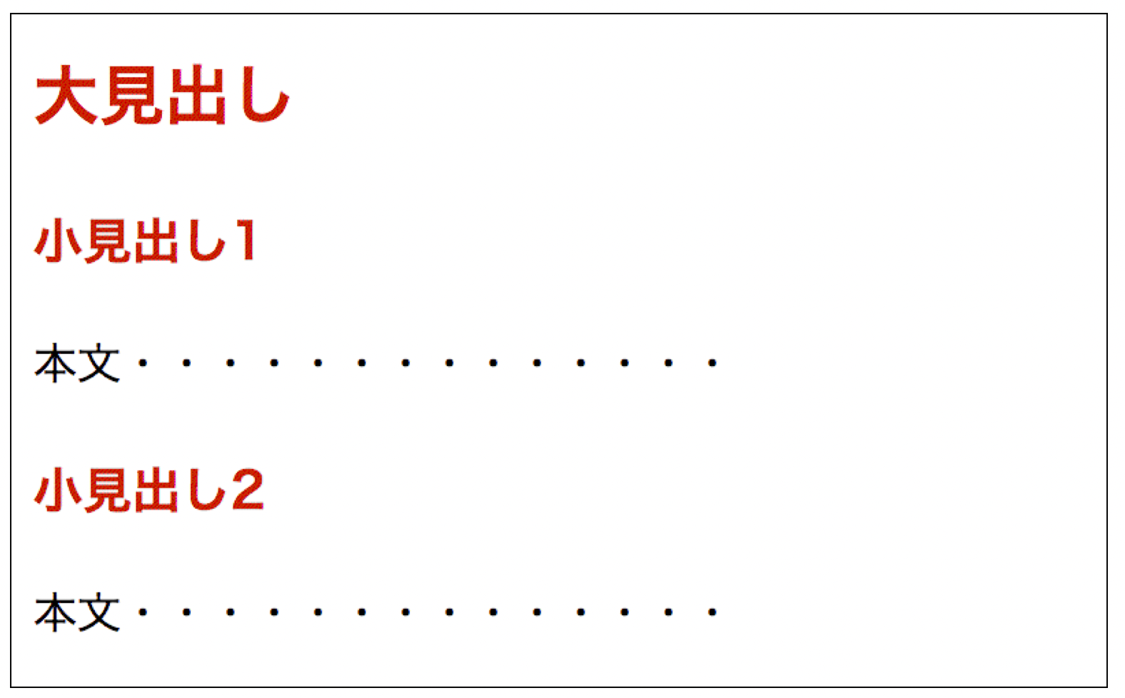
<h1><font size="+2" color="#F00">大見出し</font></h1>
<h2><font size="+1" color="#C00">小見出し</font></h1>
<p>本文・・・・・・・・・・・</p>
<h2><font size="+1" color="#C00">小見出し</font></h1>
<p>本文・・・・・・・・・・・</p>
This will be displayed as follows.

However, it is inefficient to write font tags with the same settings for each subheading, which increases the data volume of the HTML file, and when the appearance of a subheading is changed, all font tags in the subheading must be modified.
The above code would look like the following if CSS were used.
<h1>大見出し</h1>
<h2>小見出し</h1>
<p>本文・・・・・・・・・・・</p>
<h2>小見出し</h1>
<p>本文・・・・・・・・・・・</p>
h1 {
  font-size: 1.5em;
  color: #F00;
}
h2 {
  font-size: 1.2em;
  color: #c00;
}
The result of these actions will be the same as those described above.
CSS is thus responsible for the function of managing the appearance. While it is relatively easy to set up CSS for basic text modification as in the above example, defining a complex layout requires a wide range of knowledge and experience.
A mechanism to address such challenges is the CSS framework, which is used by web developers to simplify CSS code and create responsive designs more quickly and efficiently. Frameworks provide commonly used design patterns and components such as grid systems, buttons, forms, icons, and typography.
The following are some of the most commonly used CSS frameworks
- Bootstrap: The most popular CSS framework, providing numerous components and JavaScript plugins, Bootstrap includes a responsive grid system, forms, navigation, buttons, and more.
- Foundation: Another popular CSS framework along with Bootstrap, Foundation offers components such as grid systems, forms, and typography. It also provides JavaScript plug-ins for real-time data interaction.
- Materialize: A CSS framework based on Google’s Material Design concept, Materialize provides components such as icons, fonts, grid systems, forms, and navigation for material design.
- Bulma: A lightweight and flexible CSS framework that provides components such as grid systems, forms, navigation, and buttons. It also features easy customization.
Another efficient development tool for CSS is the CSS preprocessor, a tool that extends normal CSS syntax to make it easier to write CSS code, providing functionality such as variables, functions, mixins, and conditional statements to improve reusability, maintenance, and efficiency of CSS code. It provides variables, functions, mix-ins, conditional statements, and other features to improve the reusability, maintainability, and efficiency of CSS code. Major CSS preprocessors include the following
- Sass (Syntactically Awesome Style Sheets): The most popular CSS preprocessor, providing features such as variables, nesting, mix-ins, conditional branching, and loops, Sass is widely used as a tool to help create responsive designs.
- Less (Leaner Style Sheets): Similar to Sass, this CSS preprocessor provides features such as variables, nesting, mix-ins, conditional statements, etc. Compared to Sass, the syntax is simpler, which may make it easier for beginners to handle.
- Stylus: A CSS preprocessor with a more flexible syntax than Sass or Less, offering features such as nesting, mix-ins, conditional statements, and variables. Stylus is also similar to JavaScript syntax, so it may be easier for JavaScript developers to learn.
This blog discusses various applications of these CSS technologies, especially Bootstrap.
Technical Topics
CSS (Cascading Style Sheets) is a style sheet language used to specify the style and layout of documents created in markup languages such as HTML and XML, Bootstrap is a framework for building responsive websites and web applications using HTML, CSS, and JavaScript.
This section mainly discusses the various implementations of bootstrap.
- Web layout adjustment (1) Two-column left sidebar configuration
As a specific implementation of CSS, we describe a two-column left sidebar configuration used for search pages, etc.
- Web Layout Adjustment (2) Reference Books Reviews
Describe the reference books for CSS.
Bootrap is a front-end web application framework consisting of HTML, CSS, and Javascript. Responsive Web Design is the current mainstream method of web production to support multiple devices. This responsive web design consists of techniques such as fluid grids, fluid images, and media queries.
When building a website with Bootstrap, it is necessary to load the downloaded CSS and Javascript files from HTML.
Bootstrap’s layout method employs a grid system that divides the width of the page into 12 columns. This feature can be utilized when making pages in two or three columns, or when placing components side by side. The following is a description of the elements that make up Bootstrap’s grid system. First, let’s look at columns (columns) and gutters (gutters), then containers (boxes), row classes, and column classes. Then, the container (box), row class, and column class are described.
- Textbook of Bootstrap5 Frontend Development – (3) Layout Manipulation in Bootstrap (2)
Next, we discuss responsive classes that switch columns for each device; Bootstrap provides six breakpoints for switching layouts, and adding a class such as col-md-* to a column allows six levels of layout control. Here, these multiple classes are combined to build a more complex grid layout.
In responsive web design, the style to be applied is switched at a certain screen size, and this boundary is called a breakpoint.

コメント