In this article, we will discuss Topological Data Analysis.
The topics discussed here refer to Topological Data Analysis, About Topological Data Analysis, and Topological Data Analysis and Machine Learning.
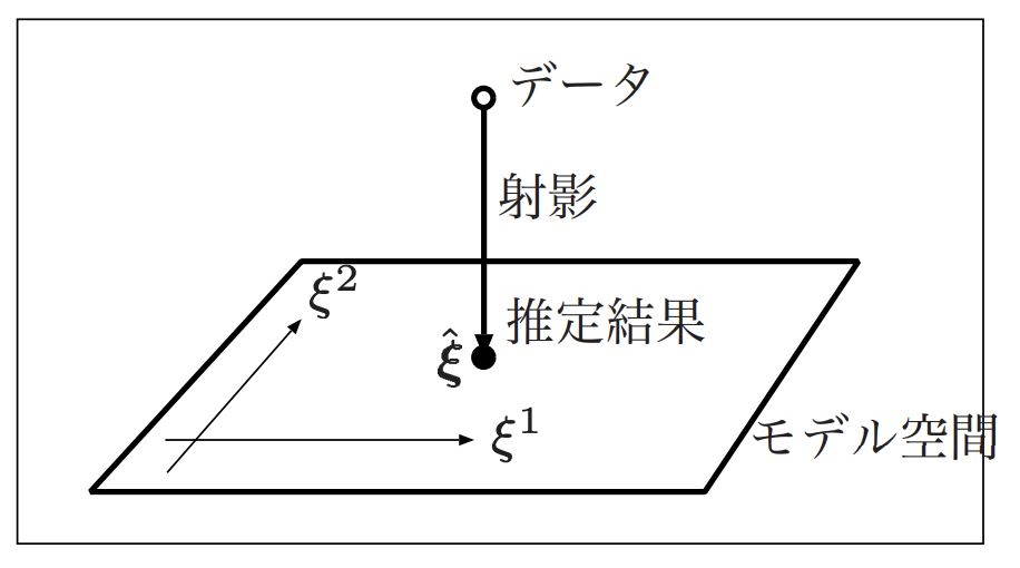
Topological data analysis is a method of analyzing a set of data using a “soft” geometry called topology. Machine learning is the operation of finding a model that fits the data well given the data, and a model is a space represented by some parameters. Given that a model is a space represented by some parameters, the essence of machine learning is to find a projection (function) from the data points to the space of the model.

情報幾何と機械学習より
At this time, it is necessary to put “structure” into the model space, and the most familiar space is Euclidean space, but many existing estimation methods for systems and statistical models cannot be interpreted in Euclidean space, and therefore, calculations (optimization) are performed assuming a space of probability distributions (non-Euclidean), called differential geometry ), which is called differential geometry. Therefore, it is also called a field using “hard” geometry. The details of information geometry described in “What is information geometry?” will be described in a separate article.
Topology, on the other hand, is like a coffee cup and a doughnut. Assuming that the coffee cup is made of an unbreakable clay-like material, if we deform it little by little, we can eventually transform it into a doughnut.

Topological Data Analysis : 導入より
At this point, the common t between the doughnut and the coffee cup is a single hole, which is a very rough feature, but it is also an essential abstraction that removes miscellaneous things.
This is another example, and the following diagram is topologically speaking the same

位相的データ解析(Topological Data Analysis)についてより
Similarly, the following figures can be said to be topologically identical.

位相的データ解析(Topological Data Analysis)についてより
The following characters with different fonts can also be interpreted as being topologically the same.

位相的データ解析(Topological Data Analysis)についてより
Topological Data Analysis (TDA) is an attempt to analyze data using such topological abstractions, and TDA can be applied to image analysis, protein analysis as described in “Shaking Proteins and Growing Old: Data Science in the Age of Misfolding,” or sensor data and natural language processing. TDA can be applied to such image analysis, protein analysis, sensor data, and natural language processing, as described in “Shaky Protein and Old Me: Data Science in the Age of Misfalls.
Here, we describe an approach that links data and graphics. Let us assume that there are five data points as shown in the upper left.

位相的データ解析(Topological Data Analysis)についてより
If we gradually increase the size of these dots, they eventually overlap, and in the lower left figure, they become a single hole (topologically the same figure as the doughnut) and eventually become a single shape (topologically the same shape as the circle, triangle, or square figure without holes).
The way this is actually achieved is by abstract monoidal complexes. Approximation by a monoidal complex is possible by the pulse body theorem (the area to be drawn around a point is a convex set (a sphere is a convex set), and an abstract monoidal complex such that K alone are elements when K+1 spheres overlap (check complex and alpha complex) has the same qualitative properties as the original apparent figure), which proves that a figure by the original set of data can be approximated by It has been proven that it is possible to approximate a figure by a set of original data. The general flow is to consider the area around a point, and from the way it is connected to the abstract monadic complex and its geometric realization (which constitutes a figure; see Figure 1), to determine the shape of the abstract monadic complex and its geometric realization. This is a combination of points and shapes such as lines and triangles, which is relatively easy to compute on a computer. In other words, it roughly approximates a figure by dividing it into triangular figures according to some rules. There are several types of rules, but we will introduce three typical methods below.
- check complex
The simplest configuration would be the following steps.
-
- Draw a sphere of a certain radius around a point.
- If the spheres are touching, they are considered “connected” and constitute an abstract unitary complex (check complex). Examples of rules for constructing an abstract unitary complex are: if two spheres overlap, one unit labeled by two points is an element of the abstract unitary complex, or if three spheres overlap, two units labeled by three points are elements of the abstract unitary complex.

トポロジカルデータアナリシス:データと図形を結びつけるより
- Vitreous Lips complex
The check-complex is the most straightforward way to construct it, but it has the disadvantage of being computationally expensive. This is because it is necessary to identify how many spheres all overlap, and as the number of points to be considered increases, the number of cases to be considered also explodes. Therefore, a simplified version of the check complex, the following Vitrice-Lips complex, is also considered. The procedure is as follows.
-
- Draw a sphere of a certain radius around a point.
- If the spheres are touching, they are considered “connected” and constitute an abstract unitary complex (Vitrice-Lips complex). The difference with the check complex is that K alone is an element of the abstract unitary complex if “any” two points of the K+1 spheres overlap, while the check complex considers that there must be a region where all K+1 spheres overlap

トポロジカルデータアナリシス:データと図形を結びつけるより
- alpha complex
A unitary complex that is complex in its construction, but does not seem to be as computationally expensive as a check complex. The procedure is as follows.
-
- A perpendicular bisector line divides the space between the points. (The line is drawn only where it does not collide with any other perpendicular bisectors.
- Each point is divided by what is called a Voronoi area.
- Draw a sphere of a certain radius around the point, and consider the common area between the Voronoi area and the sphere.
- If the common areas are tangent to each other, they are considered to be “connected” and form an abstract monoidal complex (alpha complex).

トポロジカルデータアナリシス:データと図形を結びつけるより
One use of this TDA is to analyze noisy data. As an example, consider the following data (middle) and the true model it represents (left).
トポロジカルデータアナリシス:ノイズのあるデータへ応用するよりIn the above figure, the true model is the one with large and small rings. The actual data is distributed with noise on this model. In contrast, if the radius of the spheres is small, they do not connect well, and if the radius of the spheres is large, they collapse, obscuring the small structures.
One of the TDA approaches to this problem is the persistent homology approach. This approach is to look at the transition of the figure when the radius is changed as shown below.

トポロジカルデータアナリシス:ノイズのあるデータへ応用するより
The specific procedure is to consider a sphere around the data point and increase its radius simultaneously and continuously. Then, what was initially a fine structure starts to shift from a structure of small rings, to a structure with one large ring and one small ring, to a structure with only a large ring, to a structure with no holes.
Here, the structure that changes immediately as the radius is increased is considered noisy, while the structure that is stable (maintains the same structure for a long period of time) is considered to be the essential information of the data. In the example above, if a structure with one large ring and one small ring is found to be relatively stable as the radius is increased, this structure is considered to be essential.
The transition of structure is visualized in terms of the “creation” and “disappearance” of structure, and is called a persistent diagram. The structure here, for example, refers to the generator of a one-dimensional homology group, which is roughly “the quantity that represents something with several holes.
Suppose now that the radius of the sphere is increased simultaneously and continuously. During the process of increasing the radius, we record the radius at which a new structure emerges (Birth) and the radius at which that structure disappears (Death) (i.e., another new structure is born). Plotting these radii, we get the figure below.

トポロジカルデータアナリシス:ノイズのあるデータへ応用するより
For quantities that are immediately produced and immediately annihilated, the difference in magnitude of their respective radii is very small. Therefore, the Death – Birth (lifetime) is close to zero, i.e., close to the diagonal. On the other hand, a stable structure with a long section will have a larger Death – Birth and thus be located farther away from the diagonal. In the previous example, if a structure with one large ring and one small ring is plotted away from the diagonal, this is what we would consider to have been the essence of the structure.
The TDA library described so far can be used in python with a scikit-learn-like python module called scikit-tda.
The introduction is done as follows
pip install cython
pip install ripser
The code for handling persistent diagrams is as follows.
import numpy as np
from ripser import ripser
from persim import plot_diagrams

data = np.random.random((100,2))
diagrams = ripser(data)['dgms']
plot_diagrams(diagrams, show=True)
In the case of R, a library called TDA can be used. For example, if we have the following clusters, we can use TDA to look at them topologically.

位相的データ解析(Topological Data Analysis)についてより
install.packages("TDA")
library(MASS)
library(TDA)

#Data Generation
mu1 <- c(0, 0)
Sigma1 <- matrix(c(1, 0.3, 0.3, 1), 2, 2)
x1 <- mvrnorm(30, mu1, Sigma1)
mu2 <- c(8, 0)
Sigma2 <- matrix(c(1, -0.2, -0.2, 1), 2, 2)
x2 <- mvrnorm(30, mu2, Sigma2)
mu3 <- c(4, 6)
Sigma3 <- matrix(c(1, 0, 0, 1), 2, 2)
x3 <- mvrnorm(30, mu3, Sigma3)
x <- rbind(x1,x2,x3)

#Calculation by TDA
Diag <- ripsDiag(X = x, maxdimension = 0, maxscale = 5, library = "Dionysus")

#Visualization (barcode plotting)
D <- Diag[["diagram"]]
n <- nrow(D)
plot(c(min(D[,2]), max(D[,3])-1.5), c(1,n + 1), type="n", xlab = "radius", ylab ="", xlim=c(min(D[,2]), max(D[,3])-1.5), ylim=c(1, n + 1), yaxt ='n')
segments(D[,2], 1:n, sort(D[,3]), 1:n, lwd=2)
位相的データ解析(Topological Data Analysis)についてより
The above figure is called a barcode plot. The radius of 3.5 is one figure and the radius from 2.0 to 3.0 is three figures, and the phase change predicts that there are three figures (clusters).
Another example could be to count the number of holes.

位相的データ解析(Topological Data Analysis)についてより
For example, when identifying the letters “A,” “L,” and “B,” the information that there are 1, 0, and 2 holes, respectively, can be automatically obtained and used as features to identify the letters, and by drawing a circle around the dots and making each dot larger, faded letters can be recognized.
library(TDA)

#Data Generation
image_A <- cbind(x= c(0,1,2,3,4,5,6,7,8,9,10,3.5,5,6.5) * 0.6 + 2,
 y =c(0,3,6,9,12,15,12,9,6,3,0,6,6,6)*0.55 + 1.25)
image_L <- cbind(x = c(0,0,0,0,0,0,0,0,0,1,0.25,0.5,0.75,1.25,1.5) * 4 + 2 ,
 y = c(0,1,2,3,4,5,6,7,8,0,0,0,0,0,0) + 1.25)
image_B <- cbind(x = c(0,0,0,0,0,0,0,0,0,1,1,1,1.25,1.25,1.5,1.5,1.5,0.25,0.25,0.25,0.5,0.5,0.5,0.75,0.75,0.75,1.25,1.25) * 4 +2,
 y = c(0,1,2,3,4,5,6,7,8,0,4,8,5.3,6.6,1,2,3,0,4,8,0,4,8,0,4,8,3.5,0.5) + 1.25)

#Calculation by TDA
Diag_A <- ripsDiag(X = image_A,maxdimension = 1,maxscale = 5)
Diag_L <- ripsDiag(X = image_L,maxdimension = 1,maxscale = 5)
Diag_B <- ripsDiag(X = image_B,maxdimension = 1,maxscale = 5)

#Visualization (persistent diagram)
plot(Diag_A$diagram)
plot(Diag_L$diagram)
plot(Diag_B$diagram)
以下が左から「A」「L」「B」について得られたパーシステント図となる。

位相的データ解析(Topological Data Analysis)について
This figure will plot the size of the radius when the hole is born (Birth) and the size of the radius when the hole is lost (Death) as the size of the radius of the circle around each point is increased. The number of holes is represented by a red triangle. From this we can immediately see that the number of holes for each letter is 1, 0, and 2.

コメント